
Vibe Coding
Vibe Coding Pitfalls That Make Your Site Look Fake (Dead Links, Jargon, and Mockups of Things You Haven't Built)
The vibe coding mistakes that make a real product look like a scam: placeholder icons and links that go nowhere, jargon nobody understands, and screenshots of features that don't exist. How to find and fix each one.
Published 2026-11-11.
You built something real. Then a stranger lands on the page, clicks "Features," nothing happens, scrolls past a dashboard full of revenue numbers, sees "Trusted by LOGO LOGO ACME," and leaves thinking it's a scam.
That's the most common way a vibe-coded launch fails, and it has nothing to do with the code. AI builders are very good at making a page look finished. They fill every gap with something plausible, so a page with nothing behind it looks exactly like a page with a product behind it. Visitors can't tell the difference, so they assume the worst.
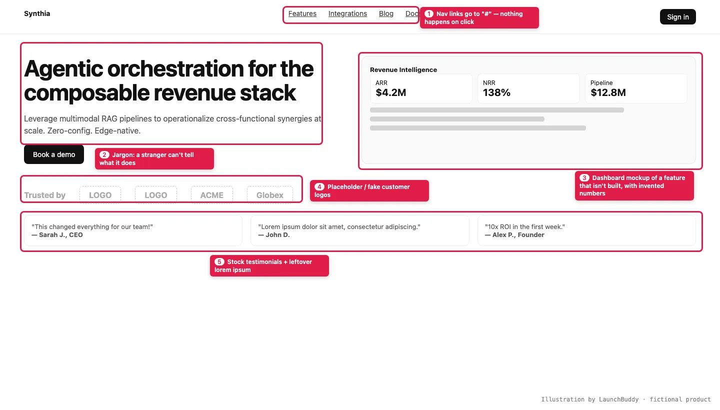
"Looks vibe-coded" has become shorthand for "don't trust this." On X this month, people used it as a reason not to trust a company and to call a site a scam that already looks abandoned. One builder summed up the repeat offenders as a purple gradient, a generic AI headline, and "a login page that doesn't work". Meanwhile the cleanup posts are some of the most-shared builder content of the fall: @heydamir's before-and-after "unslopping" of a vibe-coded dashboard passed 2 million views, and @Voxyz_ai's 20-point pre-ship pass (dead buttons, broken links, "Delete all placeholder text") drew about 650,000.
Here are the three pitfalls we see most, and how to fix each one in an afternoon.
Pitfall 1: Placeholder icons and links that go nowhere
AI fills a page with what a page usually has: a nav bar with Features, Integrations, Blog, Docs; social icons in the footer; a "Watch demo" button. If those things don't exist yet, the model points them at #. A visitor clicks, nothing happens, and that's the moment the site starts to feel fake.
What to look for:
- Nav and footer links with
href="#"orhref="" - Social icons (X, LinkedIn, GitHub, Discord) that go to the platform's homepage, or nowhere
- "Watch demo," "Read the docs" or "See pricing" buttons with nothing behind them
- Generic icons standing in for real things: a camera icon where a photo should be, "LOGO" boxes, a gray avatar on every testimonial
- Leftover lorem ipsum (still showing up in launches in 2026)
In a 295-upvote r/VibeCodeDevs post, a builder who reviewed more than 500 vibe-coded launches listed social icons that went nowhere and carousels that didn't slide among the most consistent tells. It's still the checklist people paste a year later. A r/SaaS post put it more bluntly: one search and visitors know the numbers and testimonials are made up.
The same goes for controls that are just scenery: toggles that don't toggle, a pricing switch that doesn't change the prices, a form with no success message.
Fix: delete anything that doesn't work yet. A nav with two working links beats a nav with six where four are dead. Then ask your agent to check:
List every link, button and icon on the site that points to #, an empty href, a platform homepage instead of our profile, or a page that 404s. Remove the ones we don't need yet and fix the rest. Show me the list before and after.Pitfall 2: Jargon that doesn't say what it does
Models love impressive words: agentic, orchestration, composable, seamless, AI-native, edge, synergies. Put them together and you get a headline like "Agentic orchestration for the composable revenue stack," which sounds like something and tells the reader nothing.
A 241-upvote r/vibecoding thread about why vibe-coded projects look like garbage called out "phrases that even the project's author doesn't understand." If you can't explain your own headline out loud, a stranger won't figure it out in five seconds.
The test: show your hero section to someone who isn't technical for five seconds, hide it, and ask what the product does. If they can't say it in their own words, rewrite it.
Fix: use the words your user would use to describe their problem. A formula that works:
[Product] helps [who] [do what] without [the annoying part]. "Tally helps freelancers send invoices without opening a spreadsheet."
Then ask your agent:
Rewrite our homepage copy at an 8th-grade reading level. Remove these words: agentic, orchestrate, seamless, leverage, synergy, composable, unlock, supercharge, revolutionary, AI-powered (unless it explains how). Every sentence should say what the product does or why it matters to the user.
Pitfall 3: Mockups of a product that isn't built
This is the one that does the most damage. You ask for a landing page, and the model, trying to help, adds a beautiful dashboard screenshot. It shows features you haven't built, filled with numbers that never happened: "$4.2M ARR," "138% NRR," "10,000+ happy users," "4.9★."
Then a visitor signs up, and the real product looks nothing like the picture. Or they never sign up, because "10,000 users" next to zero reviews anywhere reads as fake.
What to look for:
- Product screenshots generated by AI rather than captured from your app
- Stats, counts, ratings and "trusted by" logos you can't back up
- Testimonials from "Sarah J., CEO"
- Feature sections describing what's on the roadmap as if it ships today
Fix:
- Show the real thing. A plain screenshot of your actual app beats a polished mockup of an imaginary one. If it's rough, crop to the part that works.
- If it isn't built, say so. "Coming soon" and "In beta" are fine. Label any concept art as a concept. (See honest beta language that builds trust.)
- Delete every number you can't prove. Zero social proof is better than invented social proof. Replace it with the one true thing you have, like a quote from a real tester, with their permission.
- No fake logos. Don't show company logos unless those companies actually use the product.
Why this keeps happening
AI builders optimize for "looks complete." A blank space looks broken, so the model fills it. That's useful while you're designing and harmful once you're live, because visitors judge trust in seconds, and placeholder content is exactly what scam sites look like.
The fix is a final pass with a different question. Not "does it look done?" but "is everything on this page true, and does everything clickable work?"
The 15-minute pre-launch pass
Open your site in an incognito window, on your phone, and:
- Click every link and button. Anything that goes nowhere: fix or delete.
- Read the headline out loud. Could your neighbor explain what it does?
- Point at every number and logo. Can you prove it?
- Look at every image. Is it your real product, or clearly labeled as a concept?
- Search the page for "lorem," "placeholder," "example.com," "TODO" and
#.
Or let us do the first pass: the free LaunchBuddy scan reads your live site and flags what a first-time visitor will trip over.