
Design
What Vibe-Coded Design Looks Like in 2026: Purple Gradients, Cream Serifs, and Now Terminal Green
Why every AI-built site looked purple, what replaced it (cream backgrounds, serif headlines, tiny all-caps labels), the green look showing up now, and how to make yours look chosen instead of defaulted.
Published 2026-11-11.
A vibe-coded site isn't bad because AI made it. It reads as vibe-coded because nobody chose how it looks, so the model's defaults show through. And the defaults change. What gave a site away in 2025 isn't what gives it away now.
Below are three looks we see over and over, recreated so you can spot them (these are our own illustrations of the patterns, not anyone's real site), why each one happens, and what to do instead.
Why AI-built sites look alike at all
Models are trained on a huge amount of web code, and a lot of that code came from the same starter kits: Tailwind examples, shadcn/ui components, Lucide icons, the Inter font. Ask for "a modern SaaS landing page" and you get the statistical middle of all of it.
Tailwind's creator, Adam Wathan, put it best in August 2025 when he jokingly apologized for making every button in Tailwind UI `bg-indigo-500` five years earlier, "leading to every AI generated UI on earth also being indigo."
As one builder put it in a 412-upvote r/ClaudeCode thread, the model has no strong opinions about design, so it falls back to the average of every landing page it has seen. The complaints are everywhere: "Every Vibecoded websites looks the same" drew 677 upvotes in r/web_design in July.
Look 1: The purple gradient (2024–2025)
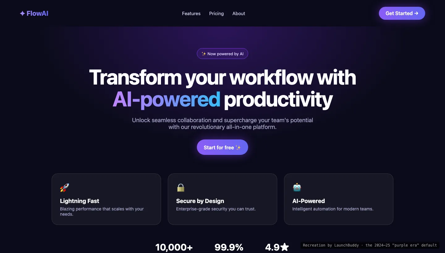
The classic. You'd know it anywhere:
- Indigo or violet buttons, and a purple-to-blue gradient on a headline word
- A dark background with a purple glow behind the hero
- "✨ Now powered by AI" in a pill badge
- Three glass cards with emoji or Lucide icons: 🚀 Fast, 🔒 Secure, 🤖 AI-Powered
- "Transform your workflow" copy and round-number stats nobody can check
Designer Yuwen Lu wrote on X in April that "Claude no longer generates purple gradients," and the newer models mostly have moved on. In late October, @edo_lunardi tried to get a current model to recreate a 2024-style purple dashboard and couldn't: "No average model produces that anymore." But the look hasn't gone away. It's baked into templates and older projects, and people still post about the "same purple gradient landing page" this fall.
Look 2: Cream, serif, and tiny all-caps labels (2026)
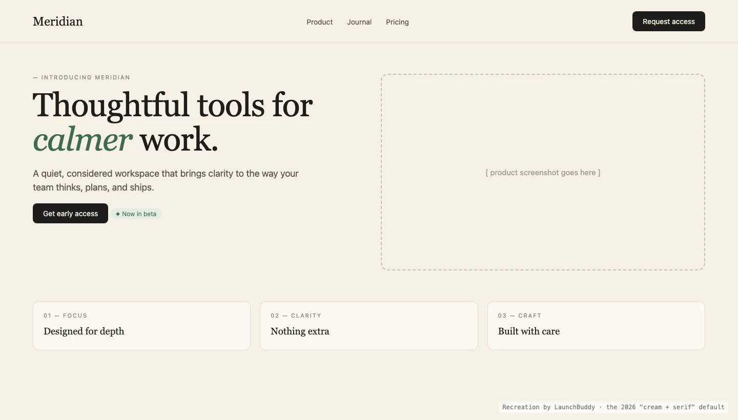
When the models moved off purple, they landed somewhere more tasteful, and then everybody landed there together. The 2026 default:
- Warm cream or beige background
- A big serif headline, often with one word in italics or an accent color
- A tiny, letter-spaced, all-caps label above every heading ("— INTRODUCING MERIDIAN", "01 — FOCUS")
- A dashed box that says "product screenshot goes here"
- Muted accents: sage, terracotta, brown
A r/ClaudeAI post from October described it exactly: "Cream background, a tiny all-caps label above every heading, and a dashed 'photo goes here' box where an image should be." Their plain Claude Code build of a landing page had six all-caps labels and two empty image boxes. In r/UX_Design, designers listed the same giveaways: Inter for everything, Fraunces when the brief says "quirky," gradient headlines, three-column grids, and two color schemes, beige/red/brown or purple on dark.
It's a nicer default than purple. It's still a default.
Look 3: Terminal green (showing up now)
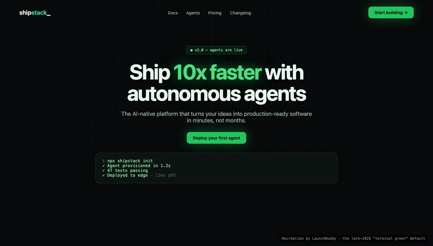
This is the newest one, and it's especially common on developer tools and "agent" products:
- Near-black background with a faint green grid
- Emerald or lime accent with a glow
- Monospace badges ("● v2.0 — agents are live")
- A fake terminal block with green checkmarks and suspiciously precise numbers
- "Ship 10x faster" headlines
An honest note: this one is our observation from the sites we review, not something we can point to a study for yet. We searched X and Reddit and didn't find anyone tying green to a specific builder (Lovable, Bolt, v0, Replit, Cursor, Claude or Codex). It looks less like a tool default and more like the "AI-native dev tool" category copying itself. If it keeps spreading, it'll be next year's purple.
The tells that outlast any color
Colors rotate. These show up in every era:
- Emoji as icons in buttons and feature cards. @tomilola_ng's list on X starts with "Don't use emojis as UI icons."
- Default shadcn cards and Lucide icons, unchanged.
- Three identical feature cards under a centered hero.
- Inter, everywhere. A dev.to comparison of v0, Lovable, Bolt and Claude Artifacts found all four loading Inter for the same prompt.
- A colored left border on cards. Designers now call it almost as reliable an AI tell as em dashes are in writing.
- Placeholder content that shipped: empty image boxes, fake logos, invented stats. (More on that in vibe coding pitfalls that make your site look fake.)
The data agrees with the eye test. One builder mined 3.2 million posts across 47 AI and SaaS subreddits for the tells people actually name. The shadcn/Tailwind look and the purple gradient led. The meme answers (bento grids, glassmorphism) ranked near the bottom.
How to make yours look chosen
You don't need a designer. You need to make a few decisions before the model makes them for you.
- Pick three real sites you like and screenshot the parts that matter: the hero, a pricing table, a footer. Give the screenshots to your agent instead of adjectives like "clean and modern." Every purple site was also "clean and modern."
- Write down five decisions: one font pairing, one background, one ink color, one accent (and where it's allowed), and your corner radius. Put them in your
AGENTS.mdorCLAUDE.mdas named tokens, and tell the agent to use only those. - Ban the defaults out loud. "No emoji icons. No gradient text. No all-caps labels above headings. No placeholder boxes. No stats we can't prove."
- Use real images. A screenshot of your actual product beats any illustration. If the product isn't built yet, say so (see below).
- Mock it up before you code it. Generate a few visual directions with image generation or Claude Design and pick one before you build. We explain why in frontier models aren't great front-end designers.
- Try a design skill, but don't expect it to choose for you. Anthropic's frontend-design skill and community skills like Hallmark help. The same October test found Hallmark took about 5x the time and usage, and a r/nocode thread pointed out that skills fix spacing and contrast, not your point of view.
Check yours
Open your site next to the three recreations above. If it matches one of them on four or more points, it reads as defaulted, even if every element is fine on its own.
Want an outside read? The free LaunchBuddy scan looks at your live site and points out what's working and what to fix first, including design that undersells the product.