
Design
What Colors Do Vibe Coding Platforms Use? Lovable, Bolt, v0, Replit, Cursor, Claude and Codex Compared
The brand colors of the big vibe coding tools, the colors their generated apps default to, and why they're not the same thing. With homepage screenshots and measured hex values.
Published 2026-11-11.
People ask two different questions with the same words:
- What colors are the vibe coding tools themselves? (Lovable's gradient heart, Replit's orange.)
- What colors do apps built with each tool come out in? ("Is purple a Lovable thing or a Bolt thing?")
The answers aren't the same, and the second one has surprised us. Here's both.
Part 1: The tools' own brand colors
We captured the homepages of several builders on November 11, 2026 and measured their dominant colors. Lovable and Replit blocked our automated capture, so for those we used their published brand material.
| Platform | Brand look | Measured background | Source |
|---|---|---|---|
| Lovable | Gradient heart logo running orange → pink → violet → blue, on a "creme" background | Creme #F7F4ED (published) | Lovable brand colors |
| v0 (Vercel) | Black and white, no accent color | #FAFAFA with #0D0D0D buttons | Our screenshot |
| Cursor | Warm off-white, near-black buttons, a painted landscape behind the product shot | #F7F7F4 | Our screenshot |
| Claude / Claude Design | Cream background, serif headline, terracotta logo, black button | #FAF9F5 | Our screenshot |
| Base44 | Warm gray background, orange accent | #F0EEED | Our screenshot |
| Replit | Orange | Not measured | Replit's site |
| Codex / ChatGPT | Monochrome | Not measured | OpenAI's site |
Lovable's published palette is the most colorful of the group: light blue #4E93FF, blue #4B73FF, violet #BBC1FF, bubblegum #FFA6F9, pink #FF0178, red #F7101D, orange #FF6D1B, yellow #FFA517, black #1B1B1B and creme #F7F4ED.
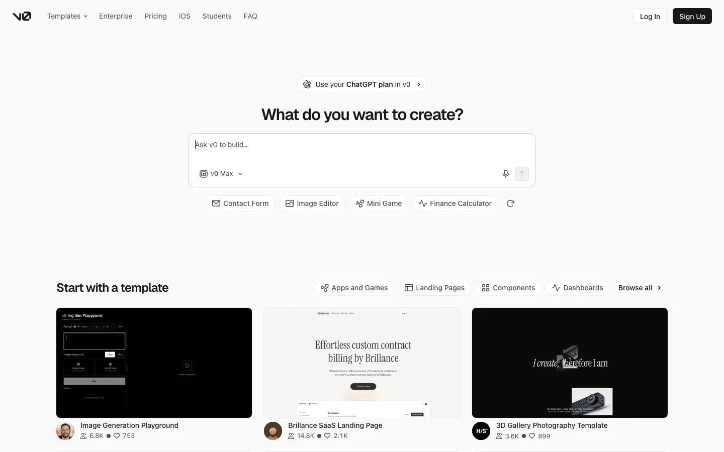
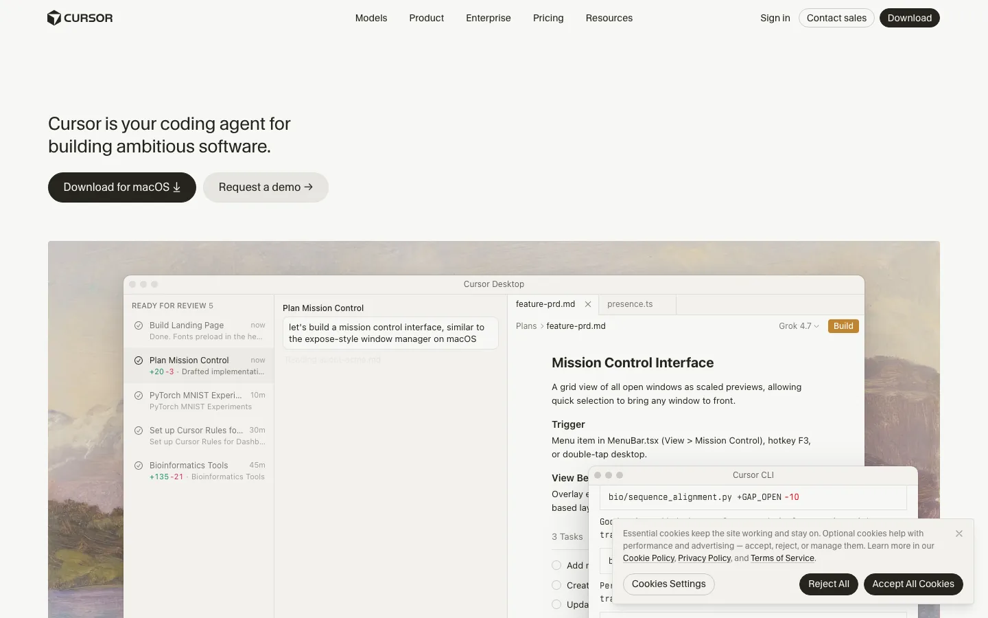
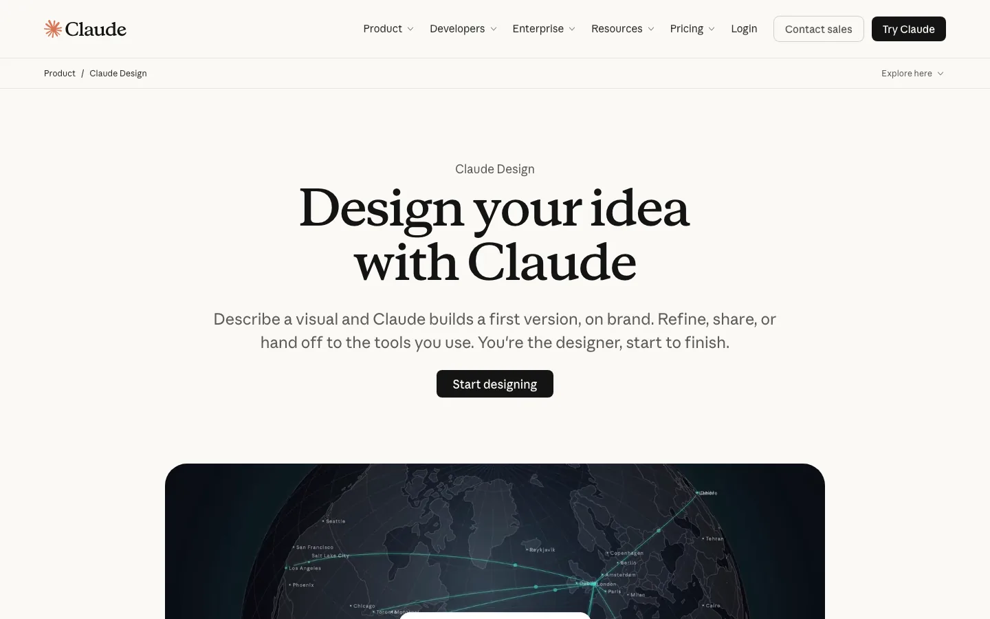
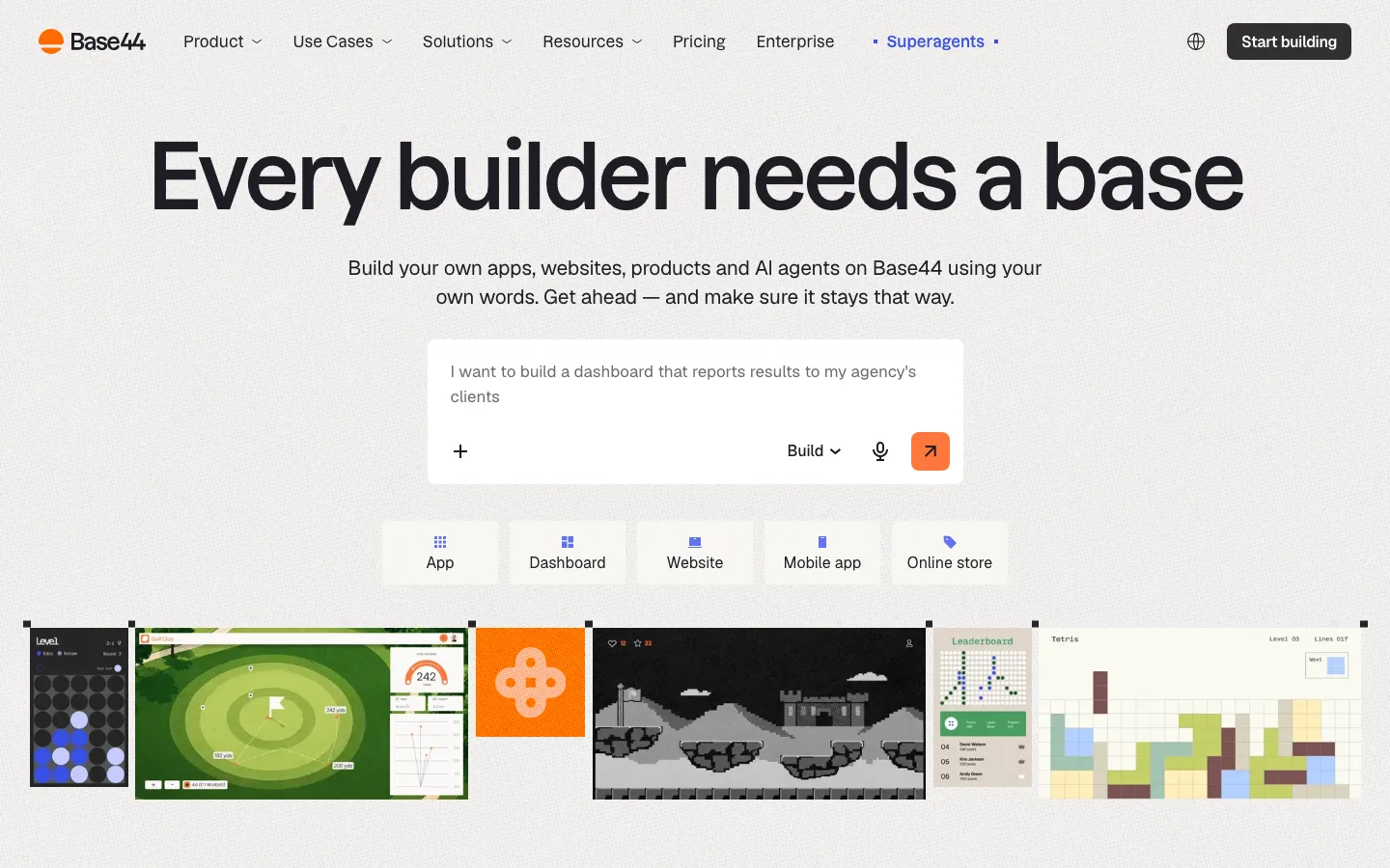
The pattern: every builder homepage we could capture uses a warm off-white background (not pure white) with near-black buttons. None of them is purple.
Part 2: The colors their apps come out in
Here's the part people get wrong. The purple in AI-built apps doesn't come from any one platform's brand. It comes from the same place for all of them: Tailwind and shadcn defaults in the training data. (Tailwind UI used bg-indigo-500 on every button for years. We cover the full story in what vibe-coded design looks like.)
What we found when we looked for platform-specific colors:
- Lovable, Bolt, v0 and Claude Artifacts were compared side by side in a November dev.to test. Given "a modern SaaS landing page," all four converged on a purple-to-blue diagonal gradient, Inter and identical rounded cards. No signature color per tool.
- Bolt gets singled out for its hero: a June r/vibecoding thread complained about the "same purple blob, same pill buttons".
- Claude largely moved off purple in 2026. Its output now tends toward the cream, serif, tiny-all-caps-label look, which, notice, looks a lot like Claude's own brand.
- Codex gets lumped in with the generic look. One builder said a Codex-only frontend was "classic AI slop" until they designed it in Figma and Claude Design first.
- Replit and Cursor come up in the "everything looks the same" complaints, but we found no source tying them to a signature color.
- Green didn't show up attached to any of these platforms in what we could find. The dark-and-green look we're seeing is a category trend (dev tools and "agent" products), not a tool default.
So if someone says "that's a Lovable site" because it's purple, they're guessing. Purple says "nobody set a color." It doesn't say which tool.
Why the tools' brands matter anyway
Look at Part 1 again. The builders' own sites have converged on warm off-white, black buttons and quiet type. Then look at the newest default output: cream backgrounds, serif headlines, muted accents.
Our read (a hypothesis, not a measurement): the look of the AI tool industry in 2025 and 2026 is becoming the look of what those tools generate, the same way the indigo-heavy SaaS sites of 2019 to 2024 became the purple default. Whatever the category looks like this year tends to show up in what the models produce.
That's good news if you want to stand out. The defaults are predictable, so a few deliberate choices put you outside them.
Pick colors on purpose
- Start from your product, not the tool. What should it feel like to the person using it? A budgeting app and a kids' game shouldn't share a palette.
- Choose four colors and stop: background, ink (text), one accent, one neutral for borders. Write them into your project rules as named tokens.
- Give the accent a job. Primary buttons and links only. If it's everywhere, it isn't an accent.
- Check contrast. Muted text on cream is a common accessibility fail. Aim for at least 4.5:1 for body text.
- Avoid the current defaults unless you mean them: indigo-to-violet gradients, cream plus serif plus all-caps labels, black plus glowing green.
If you're not sure your site reads as yours, the free LaunchBuddy scan reviews your live page and points out what's working and what to fix first.