Waitlist and pre-launch pages
Waitlist landing page examples: how to build a pre-launch page people join
A waitlist page has one job: turn a curious visitor into a name on a list you can email on launch day. Here is what the early-stage pages in our scans get wrong, what famous waitlists did right, and a sample page you can model yours on.
Data updated November 4, 2026 from 241 scans
How early-stage pages score
Based on 110 early-stage pages the scan described as pre-launch, beta, waitlist or pre-revenue, each scored out of 100 across seven dimensions by the LaunchBuddy scanner.
Average score on each dimension, as a share of its maximum
Measurement is shown for completeness: a static scan often can't confirm analytics that load through JavaScript, so it reads low on most pages.
What separates strong pages from weak ones
How often each checklist item was missing, in this group and in the pages that scored highest and lowest overall.
| Checklist item | Missing in this group (n=107) | Missing, pages scoring 70+ (n=43) | Missing, pages under 50 (n=101) |
|---|---|---|---|
| Clear headline (H1) | 60% | 5% | 68% |
| Signup or waitlist | 61% | 28% | 64% |
| Primary call-to-action | 70% | 28% | 76% |
| Product screenshots / creative | 77% | 7% | 83% |
| Social proof / testimonials | 73% | 5% | 85% |
| Social share image (OG) | 41% | 12% | 53% |
Share of scanned pages where the scanner marked the item missing. Pages can be in more than one group; small groups are directional, not conclusive.
Why most pre-launch pages leak
We scanned 110 pages that the scanner described as pre-launch, beta, waitlist or pre-revenue. Their median score was 38 out of 100, against 55 for all pages, and only 1% scored 70 or more. That is not because early products are bad. It is because a pre-launch page is usually the first thing a founder builds and the last thing they polish.
The biggest gaps for this group:
- No way to join. 61% had no signup or waitlist form the scanner could find. A pre-launch page without a form is a poster: people read it and leave, and you never hear from them again.
- No clear call to action. 70% had no clear primary CTA.
- No headline that says what it is. 60% were missing a clear H1, usually because the hero is a logo, a tagline like "Something big is coming" or an image with text baked in.
- Nothing to look at. 77% showed no product screenshot or creative.
- No reason to believe. 73% had no proof of any kind.
Across all scanned pages, those with a signup or waitlist form averaged 57.9 points, against 43.2 for those without one.
The anatomy of a waitlist page that works
A headline that says what you are building
"Coming soon" is not a headline. Neither is your product name alone. Say what the product will do and for whom, in plain words: "Invoices that chase themselves, for freelance designers." Visitors on a pre-launch page have even less context than visitors on a live product page, so clarity matters more, not less.
One field, one button
Ask for an email address and nothing else. Every extra field (name, company, role) costs signups. If you need to qualify people, ask the questions after they join, on the thank-you page or in the first email. Put the form in the hero, not at the bottom of a long page. Label the button with what happens: "Join the waitlist", "Get early access", "Save my spot".
Something to look at
You do not need a finished product to show something. A design mock, a short clip of the prototype, or a sketch of the workflow tells visitors this is real. Label it honestly ("Early design, subject to change").
A reason to join now
Give people a reason to sign up today rather than "later": early-access pricing, a founding-member badge, first access to a limited beta, or a say in the roadmap. Keep the promise specific and keep it.
Proof, even a small amount
Pre-launch proof can be the founder's name and background, the number of people already on the list (if it is real), a quote from a design partner, or a link to building in public. 73% of early-stage pages had none of these.
A thank-you state that does more
When someone joins, tell them what happens next and when. Then ask for one more thing: a short survey question, a share link, or a reply to the confirmation email. This is where the famous waitlists below did their best work.
A share preview
Waitlist pages are shared more than almost any other page type: in group chats, on X, in Slack communities. Set an Open Graph title, description and a 1200×630 image. 41% of the early-stage pages we scanned had no share image, so their links unfurled as a bare URL.
Coming soon page vs waitlist page vs pre-launch landing page
These terms overlap, but the intent differs:
| Page type | Goal | What it needs |
|---|---|---|
| Coming soon page | Hold the domain and signal that something is on the way | Name, one-line promise, email capture |
| Waitlist page | Build a list you can launch to, and often rank or qualify it | Clear promise, one-field form, thank-you step, optional referral |
| Pre-launch landing page | Validate demand and messaging before building everything | Full promise, product preview, proof, form, sometimes pricing |
If you are unsure which one you need, build the waitlist page. It does everything a coming soon page does, and it can grow into a pre-launch page as you learn.
What to measure on a waitlist page
Track three numbers from day one: visitors, signups and the source of each. Signup rate (signups divided by unique visitors) per source tells you which channel has the right audience. If the rate is low from every source, the page is the problem: rewrite the headline first, then add a visual. If it is low from one source only, that audience is the wrong fit. Add UTM tags to every link you post so the numbers are reliable.
Before you launch to the list
A waitlist decays. People forget why they signed up. Email the list at least once before launch (a progress update or a sneak peek), and keep the launch email short: what is live, the one link, and the early-access offer you promised. When you are ready to go live, work through the product launch checklist and, if Product Hunt is part of the plan, the Product Hunt launch checklist.
To check your current page against the same seven dimensions behind these numbers, run it through the landing page analyzer.
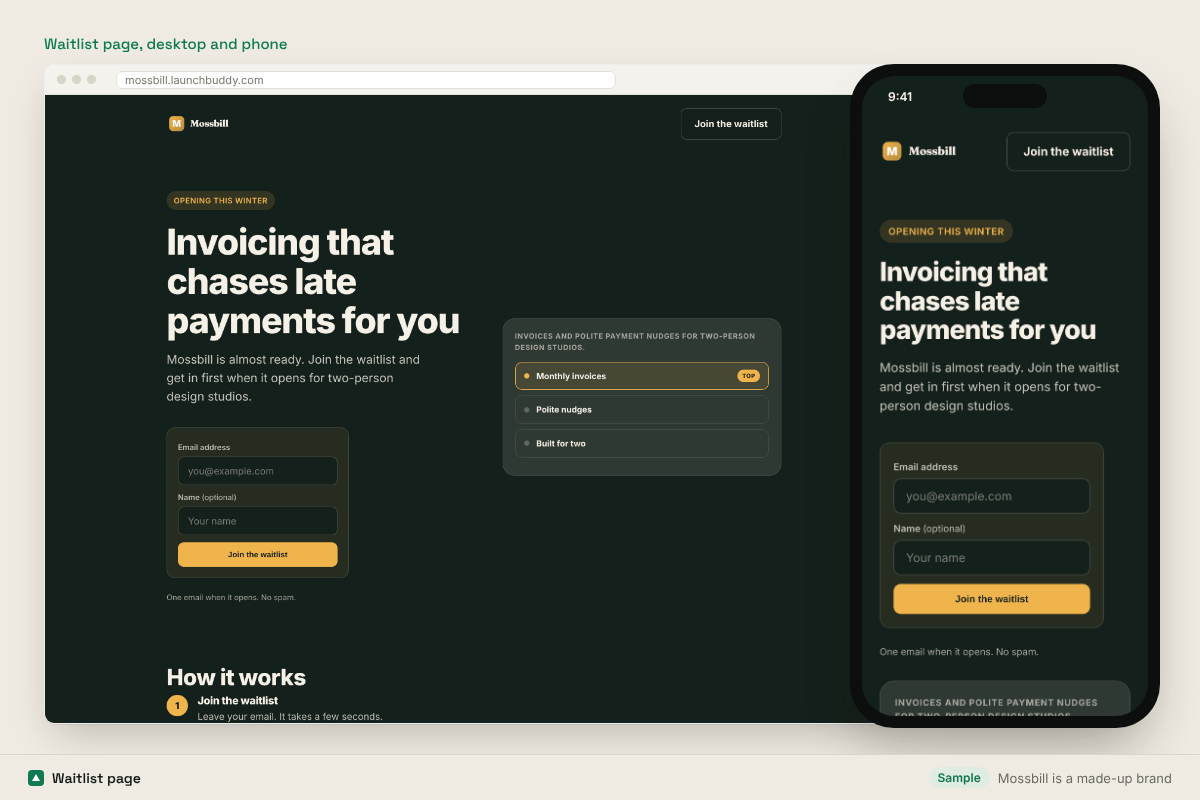
Example page (made-up brand)
Famous waitlists and early-access pages, and what to copy
Two live pages and three well-documented historic campaigns. The historic pages no longer exist in their pre-launch form; the links go to the companies today.
Warp
warp.dev
What to copyA "request early access" call to action sits on the same homepage as the download for the live product. Copy the idea of running the waitlist for your next thing from the page that already gets traffic.
Zapier
zapier.com
What to copyAn established product still uses "Get early access" for new capabilities alongside its main "Start free with email" button. Copy the clear separation between the main action and the early-access one.
Robinhood (historic pre-launch)
robinhood.com
What to copyIts widely reported pre-launch waitlist showed each person their place in line and let them move up by inviting friends. Copy the visible position: people share what they can see improving.
Harry's (historic pre-launch)
harrys.com
What to copyIts well-documented pre-launch page asked for an email, then offered rewards for referrals in tiers. Copy the two-step flow: join first, then ask for a share on the thank-you screen.
Superhuman (historic waitlist)
superhuman.com
What to copyIts early waitlist was known for a short survey after signup that helped decide who got in first. Copy the post-signup question: it qualifies the list without adding fields to the form.
Pages checked by hand on November 3, 2026. Sites change; what you see today may differ. These are independent notes, not affiliated with or endorsed by the companies named, and screenshots, where shown, document the page when it was scored.
Waitlist page checklist
- Headline says what the product does and for whom
- Email field and button in the hero, one field only
- Button label says what happens ("Join the waitlist")
- A mock, clip or sketch of the product, labelled honestly
- A specific reason to join now
- One true proof point: founder, design partner or real list size
- Thank-you state that says what happens next and asks for one more thing
- Open Graph title, description and share image
- UTM tags on every link you post
Score yours the same way
Paste your URL into the free analyzer. In about a minute you get a score out of 100 on the same seven dimensions behind every number on this page (data as of November 4, 2026), your biggest gap and the fix for it. No account needed.
Numbers on this page are aggregates from launch pages people scanned with LaunchBuddy. We never publish which sites were scanned. A score measures the signals a cold visitor sees on one page; it does not measure sales or sign-ups. Companies named in the examples are not affiliated with LaunchBuddy.