
Make the ritual concrete
Give the Financial Review a clear shape: what someone reflects on, what they see and what the next step could be.
An app, coaching and resources, with a more deliberate path into the Financial Review.
View the source site ↗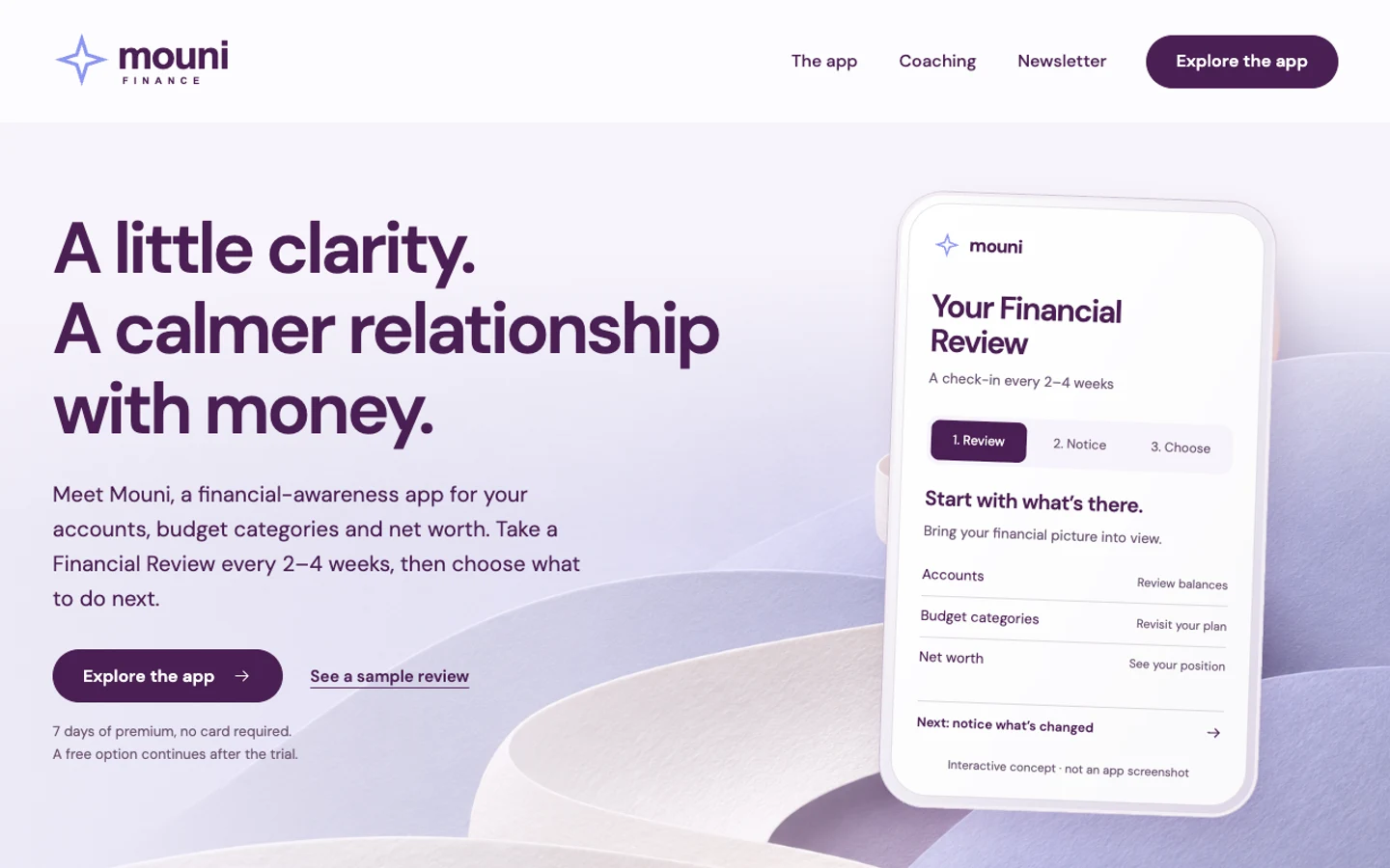
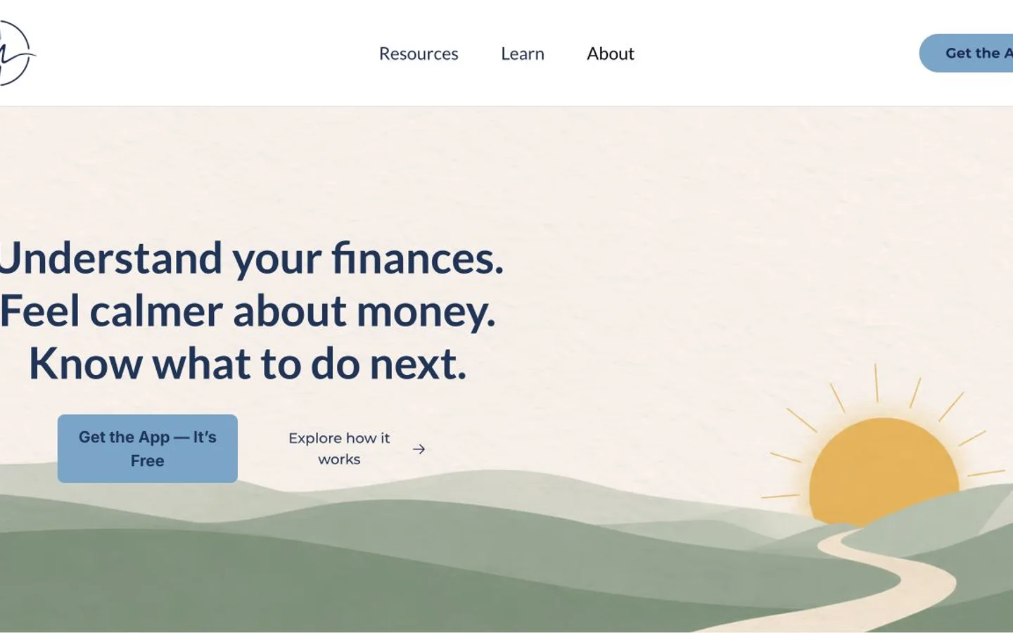
Drag the handle to compare. Arrow keys work too.
Independent design studies using public sites. Proposed work, shown as examples.
The public offer includes an app, financial coaching, resources and a newsletter. Several useful paths compete for the visitor's attention.
Keep the gentle identity. Make the review ritual tangible and help a visitor choose one appropriate next step.
Each change should address a specific gap in the story, experience or next step. Here are the decisions behind this rebuild.
Give the Financial Review a clear shape: what someone reflects on, what they see and what the next step could be.
Lead with the app, then explain coaching and the newsletter as distinct choices, without asking everyone to make all three decisions.
Use calm, measured language. Don't imply guaranteed financial outcomes or unverified bank integrations.
These are proposed questions and working assumptions for this design study, not answers supplied by the owner.
Explore the app as the first step, with coaching as a secondary path.
The opening explains the Financial Review before introducing the broader offering.
Use illustrative values until real, approved screens are available.
Show the experience without inventing customer balances or financial results.
Retain the gentle voice and established character.
Focus the redesign on hierarchy, explanation and consistency rather than a louder new brand.
A clearer website is one part of the work. The identity, social artwork, email and launch plan should tell the same story and support the same next step.

Mouni Finance
A shared palette, type system and voice.
Make a little space for your money
Explore the Financial Review and find a moment to reflect. Start with the experience that makes sense for you, at your own pace.
Explore the Financial Review ↗Design exploration. Website and social artwork are concept assets; email and identity layouts above illustrate the proposed package. Nothing has been sent.
A responsive public site with a focused message, useful pages and a clear next step.
Logo direction, colors, typography and a practical brand guide.
Matching social sizes, welcome email, signature, search basics and an outreach plan.
Keep the site with managed hosting. Domain, inbox, forms and measurement are agreed and connected separately before launch.
Preserve: The app, coaching destinations, approved identity and the owner's review language.
Confirm with the owner: Actual app behavior, integrations, current trial terms, claims and approved product imagery.
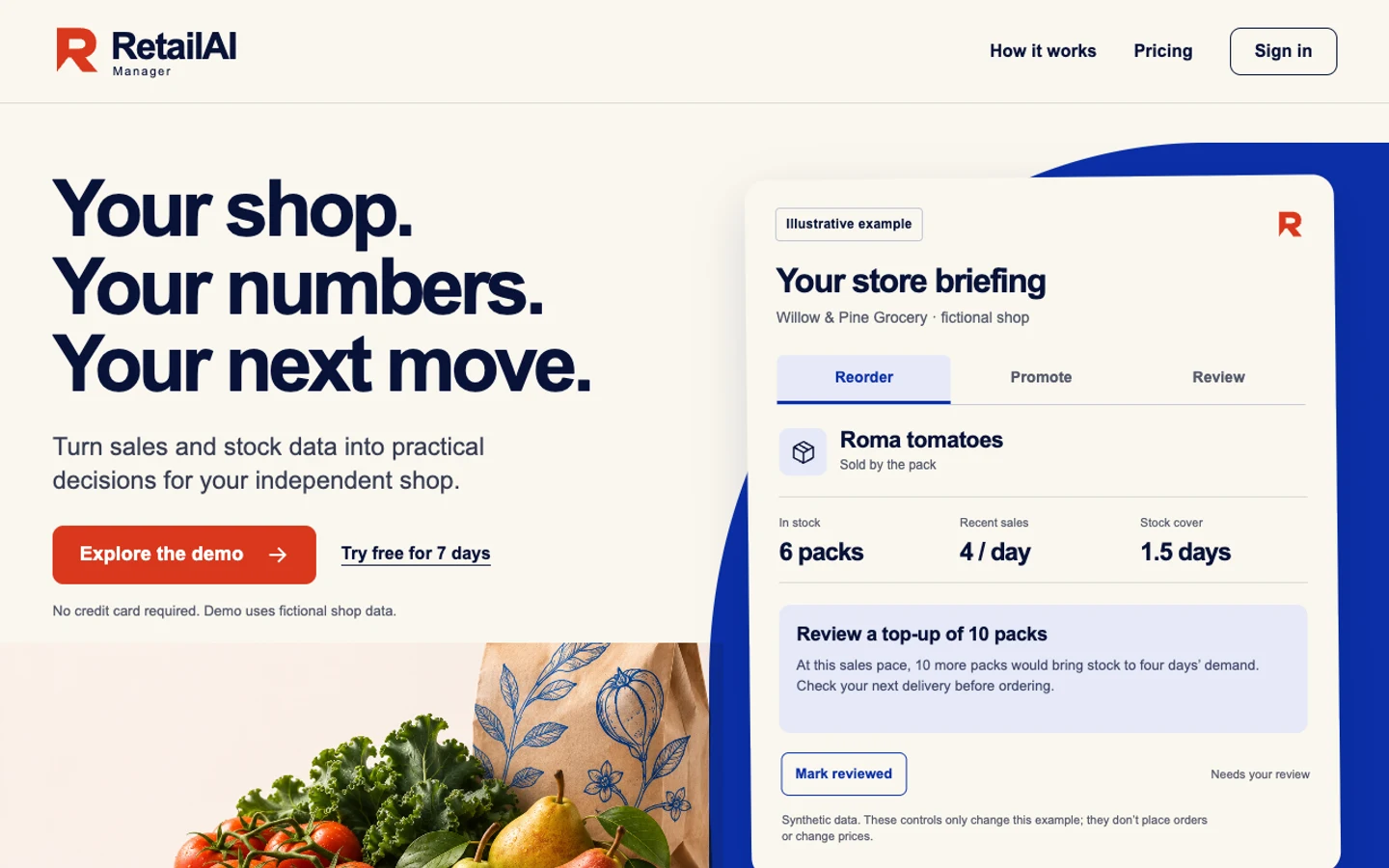

From an AI promise to an everyday shop decision. A new public face for an existing retail application.
See the before & after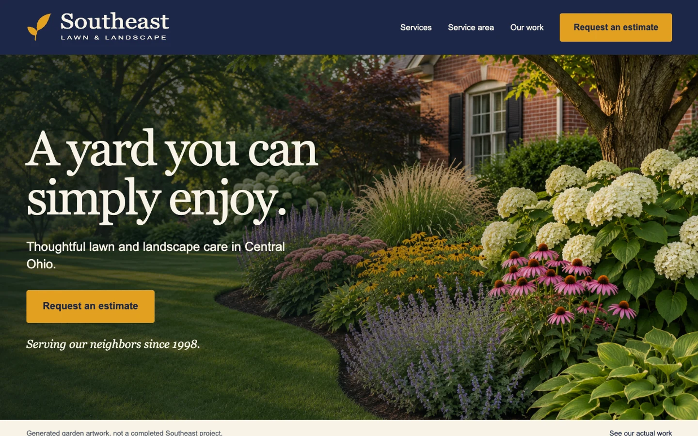

An established local business, brought into focus through services, place and one clear estimate path.
See the before & afterStart with your URL. We turn the assessment and a few answers into one focused website and launch kit.
Analyze my siteReview the scope before launch or billing.